Case Study
ALL ABOUT EATING YOUR NEIGHBOR'S FOOD.
You hear it all the time.
“Shop small.”
“Support local.”
“Eat with the seasons.”
“Support local.”
“Eat with the seasons.”
Neighbor’s Harvest came to life with the goal of bringing hospitality, fresh food, locally made goods, and a tight-knit community into a brick-and-mortar grocery store that puts the neighborhood first. Neighbor’s Harvest is located in Jacksonville Beach and sells produce grown and goods made in the southeast region of the United States.
Neighbor’s Harvest is a place where people can gather, learn, and grow. The mission of the brand is to encourage consumers to support and connect with the people and environment around them.
The Brief
Neighbor’s Harvest is a brick-and-mortar store that functions as a way for farmers and makers to sell, but not just at weekend markets. It creates a more accessible way to meet the demand for weekend market goods – but at all times of the week.
This design focused on the creation of logo variations, an e-commerce website, social media content, image treatment, and brand illustrations.
Trying to emulate the mission of Neighbor’s Harvest into the design decisions of the visual identity was the largest challenge of this project. The identity design was crucial in order to stand out from other corporate and local shops, and radiate feelings of freshness and friendliness.
Let's get started
The Process and Solutions
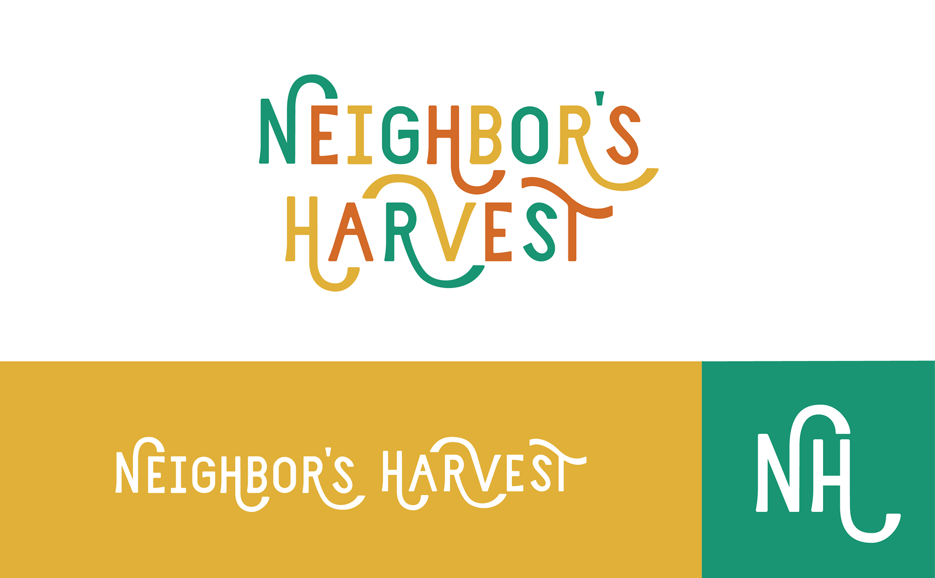
Since this is a unique store, I knew the logo had to display that. Upon market research, a logotype in the grocery industry is typical. In order to achieve a logo that illustrates support, homemade/ homegrown goods, and originality, I created a custom logotype and one that stands out against the complete default logotypes that are being used for other grocers.
Starting with pencil and paper, I created this logotype thumbnail sketch. I then brought it into Procreate and refined the idea. After sketches, I built the logotype in Adobe Illustrator.
Brand Identity
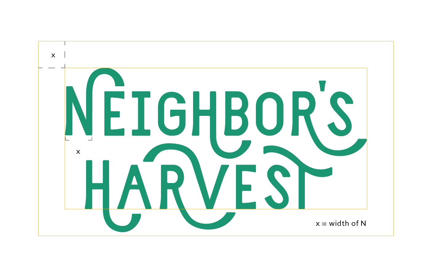
The logo is welcoming, diverse, and shows movement. I demonstrated the community pouring into each other by creating letters that have rounding extensions as swashes, pouring over the adjacent letter. I was inspired by the way water comes out of a watering canister when hydrating your plants. Conceptually, pouring into one another brings growth and flourishment. I also have added the same style of extensions swooping below the adjacent letters, representing support and trust.


wireframes
For the website, I organized the pages as home, shop, weekly specials, and blog. I started the entire process with wireframe sketches and moved to create a high-fidelity wireframe in Adobe XD. From there, I started to add imagery, color, and brand typeface.
Website Design
Applying the brand identity to the wireframes and finalizing the style.
Here are some static viewports of the desktop design.
And the same is below for the mobile design.
So let's break this down.
Color
The colors needed to feel homemade, friendly, and fresh. I chose a rich medium orange. It evokes a warm and welcoming feeling. The yellow brings friendliness, making the consumer feel comfortable and joyful The green helps bring the freshness and naturalness needed to connect with the agriculture that is the foundation of the business.
Typography
Typography is use
As for the typography used on the site, I used a typeface called Mokoko. This is a slab serif with a large family of weights and styles. I used a variety of weights throughout in order to emphasize and give typographic contrast. I thought this typeface was a perfect fit to add to the character and southern charm the rest of the design portrays. It also pairs well with the sans serif custom logotype.
Additional Brand Marks
Having other assets aside from the logo that conceptually applies to the brand helps to build a more unique and unforgettable experience for the consumer. In this case, I created a badge that resembles the old stamps that would be inked onto wooden crates of farm goods when sent out to be sold.
This asset is used on top of images in the foreground, or in the background to give depth and texture to the graphic it is being used with.
Illustrations
The entire site uses imagery that is bright and colorful. In order to add more visual interest, I placed hand-drawn illustrations onto the margins of the site, and around the content. These illustrations are done with a textured brush in Procreate with a limited color palette. These illustrations are of fruit and vegetables and have a texture that makes them feel homemade, just like the food and goods sold in Neighbor’s Harvest. The choice of what vegetables and fruits were included was based on spring crops. Since the brand is focused on eating seasonally, these change with each season. The illustrations serve as a brand pattern and are used on merchandise, printed materials, and the website.
Branded Image Treatment
Imagery on marketing materials, promotions, or any branded ephemera utilities a custom filter that gives warmth and saturation to the photography. The filter was crafted in Photoshop using an array of overlays to achieve the final look.
Image Treatment on the user interface
For the photography on the website, I rounded all corners to match the rounded extensions of the logo. I also added a drop shadow in order to bring dimension and visual interest.
Shopping Menu
Using the same illustration style, I hand drew the icons needed for the departments for the Shop page. This makes it simple and intuitive for the consumer to find the products they need.
Carousel of events on Homepage
As a way to organize, I used carousels to deliver information in chunks. I used this method with the events section on the homepage. Since Neighbor’s Harvest hosts events with other local businesses, I wanted to organize in a way that the consumer could come to the site and see the weekly events quickly and easily. There is also a call to action on each component of the carousel, with the goal of landing an attendee.
Simple and Intuitive
Ease of use was a priority when it came to prototyping. Simple to use, with small drop downs allow the consumer to quickly shop.
Social Media Content
Brand identity and digital marketing go hand in hand. The brand must be scaleable, unique, and have other characteristics besides just the logo. It was important to implement all of the brand's language, branding, illustrations, and photography treatment into the social media environment.
Conclusion
This design brings the mission of Neighbor’s Harvest to life. It connects the brand with the consumer, and the consumers to one another. The design radiates hospitality and freshness with the illustrations, colors, and saturated and bright photography. These design choices work together to highlight the values of Neighbor’s Harvest and bring unity and joy to the people nearby.

