Neighbor's Harvest is a smaller grocery store built on the foundation of supporting neighbors and friends. They believe that getting locally grown produce and locally made goods should not only be found at the weekend farmer's market.
It was important to make the brand feel hospitable, reliable, established, and community-focused. In order to communicate those values, a custom build logotype is used to communicate the concept of pouring into the person next to you or helping to hold them up. This is done by utilizing extensions of the letterforms, without making the name illegible.


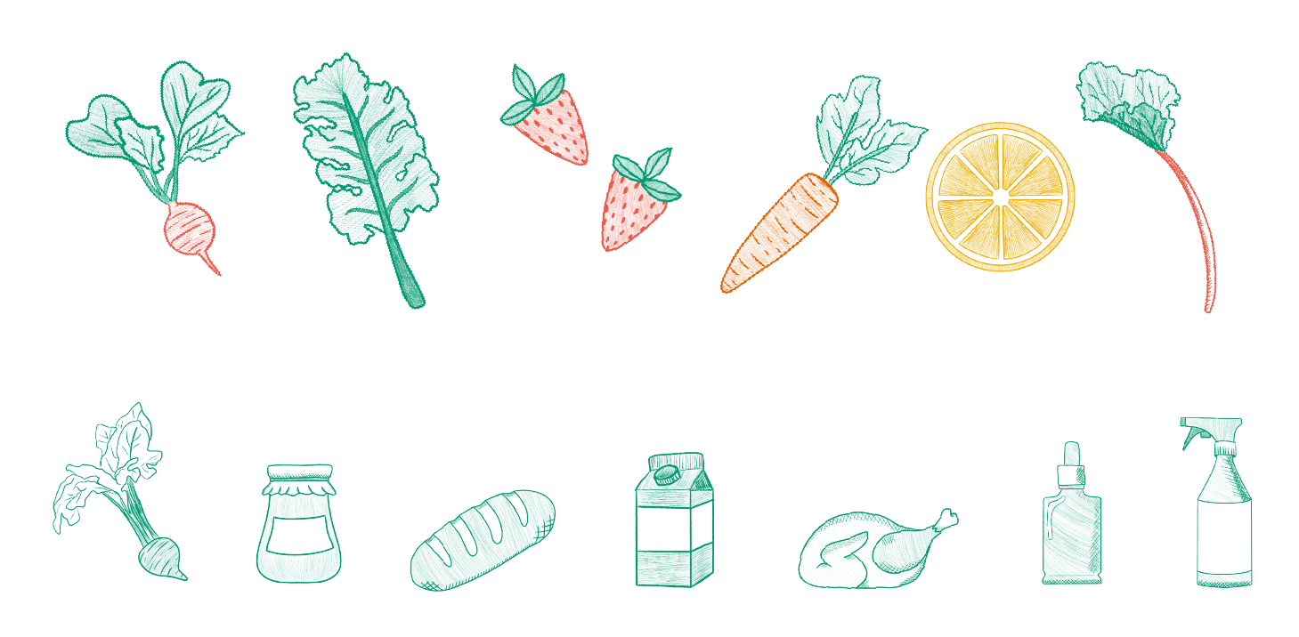
Hand-drawn illustrations are used to bring an earthy, homegrown feel to the brand. The illustrations are used as a brand element, and can be found on the website, digital promotions, and physically goods.


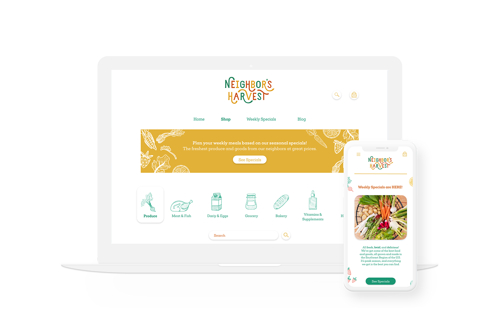
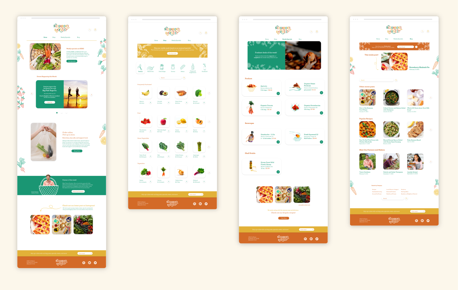
A responsive e-commerce website showcases online shopping, local events, weekly specials, and a blog. The website utilizes the brand illustrations throughout and was built with ease of use in mind.

Digital presence did not stop at the website. In order to build brand recognition, and maintain the brand's consistency, social media graphics are an important touchpoint for Neighbor's Harvest.
Interested in how I work?
See the process behind Neighbor's Harvest.
